
Friday, 28 April 2017
Thursday, 27 April 2017

Wednesday, 26 April 2017

Tuesday, 25 April 2017
Monday, 24 April 2017


Sunday, 23 April 2017

Saturday, 22 April 2017
Friday, 21 April 2017
Review: Potential Final draft Review

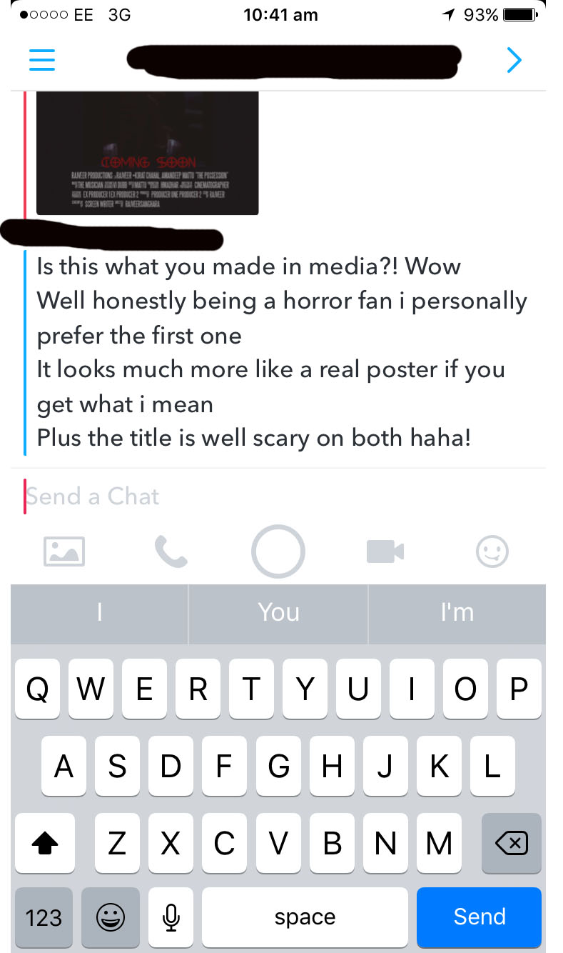
This is my potential final poster review, after a final check from both my specific target audience and teacher will it be uploaded as my final film review draft.
Thursday, 20 April 2017
Review: Horror film alternative double page spread (Negative film review)

After feedback from both specific target audience and teachers, my first decision was to change to a double page spread and secondly was to become a negative rather than positive review. This allowed me to use language tools such as rhetorical questions, speech, short and long sentences and alliteration more often. Furthermore, I inserted more images and spaced out my work.
WWW.(Teacher)
-Language is more effective.
-Title much more identifiable
-Sub-heading eye-catching
EBI.
-Spelling errors
-Grammar
Wednesday, 19 April 2017
Review: First attempt at single page review

WWW. (Teacher)
- The use of the mirror effect on the R is well done.
- Link between the image and text is done well.
- Language skills such as alliteration very well done.
EBI.
-For my first attempt, I felt that a single page positive review is the best way although I was told that the text appears to overwhelm everything else upon the single page review. For this reason a double page review may be a better option.
-Secondly the title of the film is not large enough to be seen.
Thursday, 6 April 2017


Monday, 3 April 2017
Review: Potential images
 |
The first image that I could use upon my short horror film review is this blood splattered image of a letter. Why this letter? firstly this is a key scene within the movie as it is the first scene that displays the element of blood and secondly the fact the image has a red filtered effect as well as a small element of blur makes the audience feel a tad tense. Although it could be questioned that the image is too representative of a slasher sub-genre movie rather than a paranormal movie. Secondly the image has little clue of what lies ahead and for that reason I don't feel it is very effective.
|
 |
The second image that I could've potentially used upon my horror review is the scene where blood was splattered all upon the cupboards. What could the audience assume? The audience may have get the feeling that someone has be
|
 |
| This is the third image, in this image the entity can be identified and is sculpted in such a way that it appears to be of human form although we know by this time its not the case. The image is effective as can be portray that an entity is behind the murders. As you can see one of the characters has come into contact with the entity which makes it a perfect image as the audience question the 'what happens next?' factor. |
 |
This was the third potential image. This image is the first sight of the entity, as you can see at this point its just a floating cloth although it makes the audience think whats underneath? at the point the audience can make connections with the streams of blood spread across the house. This makes the image leave the audience feeling tension as you can assume that it is behind all the murders however the image doesn't seem scary and to some it could just look like a prank from one of the boys.
|
Thursday, 23 March 2017

Wednesday, 22 March 2017
Poster: Specific target audience feedback on poster decision (Social Media)
 |
| This is the question that I asked to each of my target audience. As you can see this on a social media platform named Snapchat which allowed me to diverse the way I ask my target audience. |
 |


POSITIVE FEEDBACK:-
-Links well with film
-Effective title (Links with genre)
-Red links with horror
-The photo of the cloaked entity is scary.
Conclusion-
-The first poster is the one I decided to use after the target audience feedback.
Tuesday, 21 March 2017


Sunday, 19 March 2017
Saturday, 18 March 2017
Poster: Final poster image manipulation
 |
| This is the first image I began with, without any editing. I took the photograph on a apple I phone 7. |
 |
| To begin with I used the magic wand tool. The purpose of using this tool was to remove the background from the entity as I wanted to create my own background. |
 |
| This is the image after the background was removed. |
 |
| Now I'm creating my background, I used the gradient tool. The gradient tool allowed me to create a blood stream dripping off the wall. This was perfect as blood was used constantly throughout my movie. |
 |
| I then added a black rectangle however reduced the opacity and fill of the image. This allowed the image to be see through and can see the stream of blood behind the rectangle. |
 |
| Too finalise, I added a red photo filter. This made everything upon the page have a hint of red. |
 |
| This is the final background and front image together that I will be using for the main film poster. |
Friday, 10 March 2017
Poster: potential front images
 |
| This was the first potential image that I could've used for my poster image, this is because within the movie this is the first indication within the house that something bad has occurred due to the blood splatter. However I wanted to avoid using this image as I felt as if I didn't tie in with the horror sub genre; paranormal. Although this image does portray a key scene within the movie. |
 |
| This is the second image that I decided would use for movie was a close up of the possessed character, the mise en scene in regard to the way the character is being presented, e.g. black eyes (make up) and facial expression. |
 |
| This is the third image that was used in all of my first three drafts, after some consideration I didn't feel the image created enough tension. The image is good as it is a key scene within the movie. The lighting is low key and the camera shot is a long shot from which we can see the whole body of the main character within the film. Furthermore you can identify the cross which has religious symbolism. This is a key feature within our film as it creates more tension in the sense of making the film seem more real. |
 |
| This is the demonic presence within our movie, to create the image we asked the boy under the cloak to open his mouth and close his eyes. This image successfully conveys the possession feel as it creates the fear of the unknown as we know it isn't a human by the facial expression created. However in this in image it can be easily seen that someone is holding the cloak from behind. |
 |
| Following the same conventions as the image about however in this image you are unable to identify that anybody is holding the cloak from behind. |
Thursday, 9 March 2017

Wednesday, 8 March 2017

Poster: Editing for first draft
 |
| To start I added a black rectangle rather than a background colour as I could create effects on the rectangle such as make use of the gradient tool. |
 |
| With my chosen image I made use of various tools, firstly the crop tool to get the image to size I wanted and then I used the magic wand and eraser tool to remove any unnecessary areas as I wanted the image to blend into the background. |
 |
| At this point a image of the time has been screenshot and placed on the bottom left of the poster. This convention is from movies such as a paranormal activity which display CCTV footage with time frames. |
 |
| Now the credits and release date have been added. The release date is in a different colour to highlight more attention. The colour selector tool was used to make the text the exact tone of red that I wanted. |
 |
| The title highlights the word 'HER', this feature has no meaning although playing around with conventions, I felt this is an interesting technique that some posters use. The font was gathered from a free font website which I then downloaded to me I7 Dell laptops desktop to use from my adobe Photoshop. |
 |
| The image of the hand has been inserted as it represents trying to escape although you cant. The hand was initially black which I then used the magic wand tool to highlight and change the colour. Secondly, at the top of the poster added the names of already successful films and used a digital type font. The reason for the highlighting of red as when audience see the names of the films they know it will be a good film. |
 |
| To finalise this draft, I added a 15 age rating icon on the bottom right of the page as it is a common convention on movie posters. |
Subscribe to:
Comments (Atom)